January 29, 2010

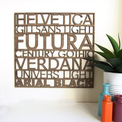
wall art typo

I love when graphic designers get crafty so it's not surprise that I am enamoured by this wall art. Described as being for 'typofiles' this not only looks great, but makes a statement about good fonts.

It is from peppersprouts' etsy shop. It has been a popular item and is currently available as a pre-order with a new batch due any day now. I've also spotted a few other items in the shop.


These felt 'eat, drink and be merry' coasters are another typofile's dream.


and how about the kissing deers in this felt trivet. There is a range of colours as well as a version with foxes.
You can also check out the range of acrylic necklaces, and for even more check out the blog

January 27, 2010

workplace inspiration - Miss Vu


january • 2010, originally uploaded by miss vu.
After enjoying a mid week public holiday yesterday, today is a bit out of control work wise.
It's the perfect opportunity to show you this very inspirational workspace by Miss Vu.
I think this is a really cool way of displaying all your favourite pics. I can see a couple of magazine covers which reminded me of the Conde Nast store I found last year.
You can enjoy Miss Vu's ever evolving workspace here.
Now I just need to find the time to make my workspace fabulous! It's not today!

January 25, 2010

Nica Handbags

Today I thought I would share my wish list (the short version anyway) from Nica Handbags' current range.
It was a black Nica handbag about 12 months ago which introduced me to this brand. I was on a dedicated handbag shopping mission. Usually when I go shopping for a specific item I come away empty handed and it was looking this way on this particular day. That's when I came across my Nica handbag. It was a range I had never seen before and I loved the decorative details on all the bags. I came away with a black Rowan bag with yellow and teal 'add-ons'. Next I discovered their online store which ships to Australia (yay!) and with the improving aussie dollar I made my second Nica bag purchase... and now I am pondering a 3rd addition.


I would like something neutral, but with a bit of colour. I like this combination of neutral colours spiced up with purple.
{top: Daffodil Grab Bag in taupe} {middle: Gladi Cross Body Bag in taupe}{bottom: Posie Clutch Purse in purple}
Now I just need to decide!

January 22, 2010

colour crush - yellow

I mentioned recently that I was relishing the chance to decorate the little 'powder room' in our house. I was on the hunt for a great mirror as a statement piece. I hit the jackpot after my little inspiration expedition. In one of those 'there at the right moment' events, the very day after my post the hubby and I were driving home when I spotted a perfect mirror. The best part is that it was just $5 from an antique store. It's a rectangle mirror with a thick wicker border. The wicker is in good condition, but the varnish has gone a slightly nasty brown colour. The plan is to revamp the mirror with a few coats of glossy black paint (this weekend hopefully). I then want to build on the black and white base with a vibrant colour that I can swap around when I get sick of it.
My current colour crush is bright yellow. Here are some great inspiration shots I've found


{another one from apartment therapy}

love this super sized bird cage {image from West Elm}
 
yellow, black and teal! What a combo {image from apartment therapy}

So what have I done with this colour crush? I turned to etsy for help of course. Here are some of my finds.


top left: Butter Yellow Poppies by The Gilded bee - I was thinking of winding these paper yellow poppies through the wicker frame of my mirror in a little cluster.
top right: Yellow Stripe Laundry Bag by Flaura Design - I like the idea of yellow and white fabric. Maybe I can stretch some over a frame for the walls.

bottom left: Mighty Mustache Hand Towel by Cyanide Stitches - This is definitely going on my wish list! I love this quirky hand towel.
bottom right: Lego Soap by Soap Lane - another totally cool addition to my wish list and it sounds like it would smell yummy with a mix of vanilla, coconut, sandalwood and more... Check this shop out for some really cool soaps like the Fight Club ones!
I have plenty of inspiration to head into the weekend with now!


January 21, 2010

Time for tea - CI Studios

A quick browse of this blog and you will discover my fondness for tea - not only to drink but also as eye-candy. Here, here and here are some of my previous tea musings.

It's no surprise really that I am completely taken by this image from the talented folk at CI Studios.
There are a few more images over at their blog of what is has been dubbed an "Alice in Wonderland meets Thumbelina tea party tribute".

Red Velvet Cupcake - Virtual Sweet Tooth

I'm trying to be very good and control my sweet tooth. I thought I would enjoy a virtual cupcake this afternoon. This image definitely makes my mouth water - a yummy cupcake captured wonderfully! Not sure it's helping quell my sweet craving... especially when I learn that this cupcake came from The Cupcake Bakery, Sydney. Really happy I don't work in the city!

January 20, 2010

Feel Good Fashion - the Uniform Project

Ever look in your closet and think you have nothing to wear even though there physically is no more space to fit any more clothes? I had a moment recently where I looked at my wardrobe and my drawers... and my chest and thought "I have way too much clothing". I have been pondering doing a re-evaluation of all my stuff and cutting back my clothing to a core set. More importantly I want to establish my 'look'. I'm not sure what that is exactly, but think I might actually try and define it with some mood boards.
It seems like fate now that yesterday I cam across the Uniform Project. It's a fascinating project on so many layers.
The main concept is 1 dress worn every day for a whole year. Sheena Matheiken, the projects founder and creative force (and clothes horse) takes the same black dress and creates a new look every day with accessories, layers, hats and shoes. This in itself is a wonderful concept to watch. The nice twist is that some of the add-ons are donated.


Here is the dress on day 1 as a 'blank canvas'. There are plans to sell this dress. After you look at the amazing versatility Sheena and the dress designer and creative partner, Eliza Starbuck get every single day out of it you can certainly see that it would be a great wardrobe staple. It can be worn both ways round, under over and around all sorts of clothing and accessories. This is certainly a uniform I would be happy to wear.

Above is a snapshot of some of the September outfits.
You can view by the month or individual days. Beginning last May this dress has already been through a northern hemisphere (New York to be exact) summer, autumn, winter and a recent trip to India.


Day 45. Sun, June 14 2009 The uniform dress is extended a fabulous wedding outfit.


Day 234. Sun, December 20 2009 All rugged up for the snow in Brooklyn


Day 256. Mon, January 11 2010 A day in Mumbai
The second aspect and more noble aspect of the Uniform Project is that it is all to benefit the Akanksha Foundation which works to fund the education of  kids from India's slums.
You can find lots more out about the project, the foundation and the recent India trip over at the Uniform Project Blog.
It is really an inspiring project and certainly has brought my whole wardrobe excesses to the front of my mind.

January 19, 2010

Sweet Baking - Sugar & Spice Tags

As an out and proud sweet tooth, I wish I had more time for baking. I've already confessed a passion for macarons and even made a (failed) attempt at baking some for Christmas. They will take some practicing to get right. I've stuck to simpler baking since, like some sherry soaked Christmas cakes and some Finnish pulla (sweet buns). I think baked goods are always a nice gift and today I have found some great ways to make them even more presentable. These Sugar & Spice tags add some fun and colour to plates of food.

These are from Farouche's Etsy shop. I like the quirky phrases like this one above about Grandma's dentures.


I also really like the photos of these products. They are so colourful. There is a good mix in the illustration styles but they all have a great retro feel to them and the colours are so vibrant.

  
You can also check out their range of Giclee prints. These come in beautiful, vibrant colours and are all individually hand printed. Once again there is a great sense of humour in the quotes and images.
I am definitely a Farouche fan and am now off to check out their blog.

January 18, 2010

pretty prints - Martini dresses

I find that summer draws me towards beautiful prints, especially in clothing. One of my dream jobs would be to design patterns for use in fabrics for both upholstery and fashion.
Today I turned to Madaboochoo for a browse through pretty summer prints in clothing. I have previously found inspiration browsing through dresses and today I have discovered a new label, Martini.


I think this Crane Print Kaftan Style Dress is so elegant. I love the use of the print as a border along the bottom. There is another style dress which also uses this fabric, but I prefer this style. I think the kaftan cut has a more oriental feel which matches the crane print beautifully.
 

My second pick today is this Cream and Blue Lace Embroidered Floral Print Dress - also by Martini. I love the back view with the lace straps and ribbon tie. I really like the way it has been accesorised with the belt in the left image. It gives the dress a romantic and eclectic feel. this would be great for a summer wedding or party.


My 3rd and final pick is a riot of colour. This Satin Feather Print Maxi Dress screams summer. It's bright, fun and the maxi dress style is so easy to wear. I really like the detail in the feather print. It looks almost 3 dimensional.
It's fun to virtual shop like this. If you do need a dress though - there is 40% off all full price stock right now at Madaboochoo. If you are interested  in shopping, the prices of these dresses are all under $120 (including the discount!)

January 15, 2010

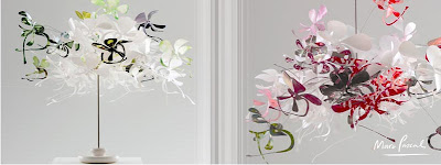
one day...Marc Pascal Lighting

One day I will own one of Marc Pascal's beautiful light pieces. Until then I can take pleasure form just having a look at them every now and then.
My original crush was on the Eyoi Yoi pendant light (named after a favourite phrase of his young daughter)
The light comes in various colour combinations - there is green medley that I particularly favour.
The stylised butterfly shapes are suspended from wires so there is a gentle movement to it. Light passes through the polycarbonate material so that the piece glows even without the light on.
This image sums up the beauty of the materials and shape really well.
Since this piece was designed, Pascal has created a few more lighting collections which I also love.
My second favourite is definitely the Orchid range. 
You can certainly see the inspiration of the orchid flowers on these more intricate shapes. Using the same technique of polycarbonate shapes suspended on wire, this is a more ornate piece using varigated colouring on some of the pieces.

And finally there is an all white collection - the Acacia.
Which would you choose? I'm still partial to my first favourite - the Eyoi Yoi
If you want more - check out Marc Pascal's website
There is also an interview (a few years old now) from The Age newspaper.

January 14, 2010

tweet tweet - Cuckoo Clocks and beyond

As the year gets off to a flying start I thought I would do a bit of clock watching today.
There are some really cool, quirky clocks out there like these modern takes on the Cuckoo Clock

Top Left: Progetti Cuckoo clock - a very modern take complete with a little bird in his house
Top Right: Cuckoo by Artificial - a slick, clean cut adaptation of the traditional design, this time the cuckoo is hidden behind a tiny door at the top.
Bottom: Halftime Cuckoo Clock - another modern take on the design with a clock face on the front of the bird house and a silhouetted cuckoo bird coming out the side
I would happily attach any of these to a wall in my home, but as I mentioned already I am on a self imposed bird ban. So no cuckoo clocks for me.


I love these running guys - uomino clocks by diamantini & domeniconi. They are so much fun and look amazing on this bright yellow.

They also come in a table top version.

This Butterfly Clock is a great way to turn the function need for a wall clock into a piece of art.

...and finally here is something with a retro feel. These mantle dome clocks are also a great way to disguise a clock in a decorating item.

January 12, 2010

Packets of light


Packets of light, originally uploaded by the cheshire smile.
Short on time today but wanted to find and share something pretty for today. I think this beautiful image certainly fits the bill.
Check out all the lovely photos in "the cheshire smile's" flickr stream.
I particularly love the Comforts of Home set (look out for the amazing camisole by the window photos) and am also loving the Les Fleurs set which is where I found the above image.

January 11, 2010

Get crafty

Want to learn how to make these?
 
This very cool and crafty little birdcage garland is courtesy of Laurie Cinotto. I went on a bit of a journey after first spotting them over at Creature Comforts, which led me to the full instructions here at The Brides Cafe.
It's a great little decorating idea and the instructions are really detailed and make it seem quite easy!


For more great crafty ideas had over to Lauries own blog - La La Laurie.
This is one talented lady.

I really like these little birds in this garland, once again created for a wedding site with all the instructions and templates.
I actually have recently added up the number of birds I have around our home as decorations and have reached capacity. Any more and I will be like a cat-lady but with inanimate bird objects!
There is something really appealing about bird shapes in decor items - but I need to find something new! That can be part of my new year goals - a new decorating motif!

January 7, 2010

summer continues

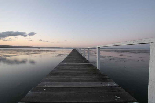
A teeny tiny celebration of the fact that even though the work year is kicking off again, Summer continues. This is from Long Jetty on the NSW Central coast, just outside The Entrance where my hubby and I spent a very impromptu day. It's nice to travel away from home for a few hours and take in the sea and a some relaxation.
{image by Jason Gazal}

January 6, 2010

pure pebble joy

I have something so sublime to share with you. The most perfect pebble image.

This little wonder is an untitled photo taken by Australian sue.h - who takes photos because it makes her happy and it certainly makes me happy too!

Here's another stunning image in black and for true eye-candy check this image out here floating on a black page.
These images are part of a pebbles, stones and rocks collection. Check out the slideshow. It's wonderful.
Aming some of her other amazing collections are a black and white floral set and a still life colour set with many gems like this ball of string


A truly talented lady and a joy to browse through!

a little space to decorate

So I have a little room (a powder room if you like) that has just been lightened up with a white coat of paint by my hubby. I'm excited and ready to flex my decorating muscles in the smallest room in the house. I have had some vague ideas but thought I would go out and look for some more inspiration. I headed straight to Living Etc and checked out their bathroom galleries
 
I like this very feminine approach. Unfortunately I don't have the budget for those really cool tiles or room for a hot pink chair either... but I do like the mirror. I am quite partial to round shapes and already have an amazing big cut work mirror sitting right outside this rooms door. It might be nice continuity having an round or oval mirror.

Here's a way of injecting some colour. As a separate little space which sits behind a closed door most of the time I like the idea of introducing an all new colour to our home. I have been partial to this shade of acid yellow for a while. This could be a good way of sprucing up a second hand mirror.

I could also introduce some colour with a feature panel behind the mirror like this. I initially thought of a great wallpaper panel and got excited at the prospect of only needing a small amount (therefore it was affordable) but the reality is that would run behind a sink and get water damaged very quickly. A bright paint colour though is a good comprimise.

This mirror with a little ledge for a teeny tiny display is a great idea. I'll have to look out for one.
Anyway I am quite inspired now to go out and search first for a mirror and then get a colour theme going.

January 5, 2010

100s & 1000s of inspiration

I am the proud new owner of an amazing DSLR camera - a Canon 500D (thanks Santa) and have come across this amazing competition run by Canon through their EOS website (which in itself is very inspiring especially for those wanting to learn more about their cameras ability!).
The competition is called Photo5 and it consists of themed challenges. You need to register for the main challenges and you receive a box in the mail which contains your brief and some materials to use. This years themes were Splat, Close-Up, Bokeh, Portraiture and there was also an open brief of Practically Black.
I'm particularly fond of the Close-Up challenge. It involved getting up close and personal with 100s and 1000's candies.

This is the winning photo by  Sam Hobson. It was a popular type of shot to do and there are a couple more eyelash shots in the gallery of all entries. I think the moodiness of this and the beautiful soft focus is what got it out in front.
Here are some more amazing shots for the up-close entries:


I like the child theme to these photos - after all a fairy bread sandwich is a childhood joy!


More colour and little smiley thumbs up!
{top: cidtow | bottom left: 100's and 1000's - mark (this was a finalist) | bottom right: Smile - Justine}


The creativity of all these entries is amazing and looks like it was a lot of fun coming up with the ideas and then also getting the shot!

LinkWithin

Related Posts with Thumbnails