September 28, 2010

positive kismet

Talk about kismet! I've been having a completely horrid few days at work and just went for some time out to The Design Files in search of eye candy - and there was a whole post on Positive Posters.
 {image via The Design files}
Positive Posters is an international poster competition in its second year. Established in Victoria, Australia by graphic designer Nick Hallam the competition "gives graphic designers an outlet to create freely, and to use their skills to inspire, challenge and make a positive difference in a non-commercial way". Ahhhhh how nice! This could not be more appropriate for me as all my creative juices are being stifled by corporate bureaucracy at the moment. The brief for this years competition is based around this quote by Benjamin Franklin:

I haven’t failed; I’ve had 10,000 ideas that didn’t work

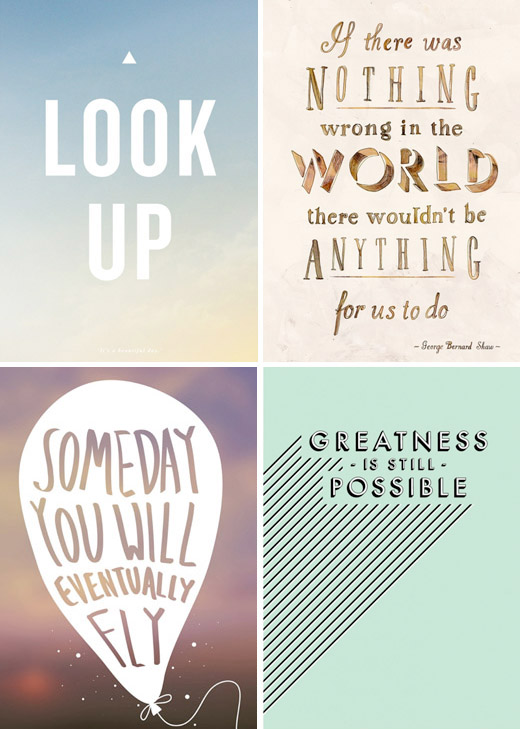
You can check out the gallery of finalists here. Somehow Lucy at Design files managed to capture my top 4 from this list - all of which I want to plaster my workspace with :-) 
Jump over to Positive Posters and find your favourites from this years competition as well as loads of positive messaging packaged in great design! Also, drop by The Design Files and see if you can't find your own inspiration!

September 27, 2010

pretty places - the happy home

The Happy Home blog is one that has been in my 'daily reads' list for a while and today I want to share a tale of curtain rods. Belinda Graham is the web editor for Real Living magazine (a favourite of mine for very practical but stylish ideas) and she also authors this lovely blog sharing some fabulous decorating ideas as she renovates her home.
I was reading through the pages of her blog and came across her "Let there be (temporary) light" blog post. It is Belinda's tale of tracking (or hunting) down curtains (and lights) for her living room. I found myself laughing out loud and nodding along as she recounts her treks to Ikea and the "choose-your-own-curtain-rod buffet" at Spotlight as I too have recently walked the same path. While perfectly OK, the living room curtains that came with our house are hung off the ugliest curtain rod and rings I have ever seen (they are also in our bedroom). All the other windows in our house came with timber blinds when we bought, taking away the dilemma of window decorations when we moved in and we have just put up with the rods for now. We have two sets of tall sliding doors that lead out to our courtyard and the curtains (completely OK dark chocolate bouclé fabric) fit the decor well and more importantly keep the cold out in winter and the heat in summer. So far I have found some pretty decent ready made curtains, but alas we have lovely high ceilings which = non-standard curtain drop lengths. In turn this means custom made curtains = $$$$ and so new curtains go back to the home decor wish list.
There is hope though - and this is where Belinda and her blog come in. There was more head nodding as Belinda recounted her desire for white curtain rods on her white walls. She has ended up with black rods (read why in her post and see the lovely picture above) and I think that she has saved me from a decor obsession. You see I was having trouble finding white curtain rods I liked with the right level of "whiteness". I agree with Belinda that darker curtains on a white rod could end up looking like they were floating mid air. So with that blog-land has given me inspiration - perhaps I can keep the curtain we have but just find a replacement rod - and it doesn't have to be white - hooray!
Please pop over to The Happy Home blog and see if she can inspire you too.

September 24, 2010

pretty post


To Brighten Your Day, originally uploaded by Trisha Brink Design.
In the midst of a crazy Friday, this image from Trisha Brink Design has made me smile. Isn't this the type of mail we would all prefer to receive!

September 23, 2010

a pretty way to read

I have a new favourite gadget - an e-reader. As an avid reader, my book collection was becoming a challenge as I was rapidly running out of ways to store them. I don't like to throw away books I have enjoyed as I know I would like to re-read them one day. Worse still I seem to like reading books from a series or collect books from a favourite author (or 2). I have donated a lot of books but that wasn't solving my problem. There was also a financial issue as well - books aren't cheap! Anyway enter my lovely e-reader with e ink (it's not an ipad) and I have devoured many novels with no space issues. It was fantastic when I was overseas as I effectively took 50 books with me without excess baggage issues (I read the entire Stieg Larsson Millennium trilogy while on holidays). Today I found an etsy store full of lovely, pretty ways of carrying around my gadget and others like it.
The Elizabeth David Design store has lots of beautiful fabrics used to pretty up practical things like organizers, phones and e-books and ipads. Using great fabric patterns from the likes of Amy butler - in fact check out all the fabrics available in the Flickr gallery here. My e-reader currently sits in a boring black leather case which I would happily trade in for one of these lovely covers instead! I love how much effort is taken to create a beautiful combination of fabrics inside and outside. Now I just need to pick a fabric - what a fun chore! Join me, even just to see the wonderful work and fabrics used in the etsy store.

September 20, 2010

Sweet Paul - does it again

I've shared my love for the super talented stylist Paul Lowe aka Sweet Paul before. He showcases his talents through his popular blog and just now has celebrated the release of the 2nd edition of his online magazine. The Fall 2010 issue is packed with beautifully styled images, crafty ideas and drool worthy recipes! I'm just happy that it's still a little cool here so I can appreciate all the hearty, warm food he has in this issue!
Here's a bit of eye-candy to get your week started - but do pop over and browse all 109 pages of the Sweet Paul Fall 2010 emag. It's well worth it!
This table setting on page 102 is lovely and simple with beautiful textures and colours, but how can you look past that incredible lamp by Sarah Foote!
How about this super stylin pumpkin from page 14! Be sure to check out the full design collection!
 

Paul really gets his food prep and styling muscles flexing in a great 6 page mushroom recipe feature. These images are amazing and they look super tasty too!
And to finish off with desert I dare you not to drool over this Salted Caramel and Chocolate cake!
{all images from Sweet Paul Fall 2010}

September 17, 2010

i wish - wall vase by otchipotchi

Today I'm drooling over these lovely unglazed porcelain wall vases from otchipotchi.
I love the idea of collecting a single flower or stem and placing them in these little delicate pods. They have a lovely handmade quality and I would happily have a few of these on my walls. I think even empty you could cluster these together to make an interesting feature!
The otchipotchi shop is full of little gems, like these doily stones (yes more pebbles!)
These lovely pieces are the work of Portuguese artisan Paula Valentim, you can view and buy her work from her online store here and also learn more on her blog.

September 15, 2010

wedding inspiration - vases, bottles and more

Today I thought I would share with you some little bits of inspiration I've been collecting for a friends wedding. I am thrilled to be styling the event (so much fun!) and have been busy working with the bride to pull together the look we're going with. One idea we are following through on is using an eclectic mix of vases and bottles in the decor, both on the tables as well as around the venue. The overall look we want to achieve is a classic romantic look with a nice looseness to it that suits the couples personality as well as the venue. Here are some pictures that make up my moodboard for the day.
These beautiful images were captured by Marianne Taylor of London couple Emily & Owen's wedding. The bride had collected the vases and bottles from op-shops and markets. I will be using similar pieces, but sourced from within the brides and grooms family. There are some beautiful crystal glasses and vases of all different shapes for me to play with. I really like that there will be that personal touch in the decor of the venue!
This dreamy purple theme is from another wedding photographed by Marianne Taylor, this time in the English countryside. The reception was held in a farm house and featured garden flowers like lavender and hydrangeas displayed in sweet little glass vases,  silver teapots and dainty cups and saucers. This is the relaxed yet romantic feel I'll be trying to capture on the wedding day.
Here are a few more images along the same theme (sources under each image)
 {Stylish country wedding on Wedding Chicks}
{a rustic outdoor wedding from Once Wed}
 {even a watering can gets a look in for this backyard wedding on Style Me Pretty}
{coke bottles can be pretty too - Style Me Pretty}
{i love the science theme with these beakers and old filing cabinet - what a great prop! - Style Me Pretty}
{time for one more beaker shot - again on Style Me Pretty}

September 14, 2010

a new pretty place - eat drink chic

I love discovering new places to visit and find pretty inspiration and lately I've added a new blog to my 'daily reads'. Eat drink chic is authored by Amy Moss in Melbourne, Australia. She had my heart when in her bio she writes " i like pretty things. obsessively so". I'm sure you're all nodding along with me at that statement. It turns out we have more in common, as we both have toiled away for a decade or so as graphic designers, only to realise that the job is nowhere near as creative as we would have hoped! Once again I'm right there with her! To satisfy her creative needs, Amy has travelled down the path of styling and creating pretty graphic design giveaways through her blog. Amy has such a pretty style using floral prints and pretty colours. She also has a great eye and her blog is full of inspiration on fashion, homewares and design.
This is one of her printable download freebies (get it yourself here). I love the colours in these Summer Vintage Floral Gift Tags and I can see that a career in styling is working for her as all her photos are beautiful!
I just love the buttons used in these ThankYou Cards! What a lovely ladylike touch!
These, as well as the Love tags below are both articles Amy has contributed to wedding style website Once Wed.
I really get a kick (and a bucket load of inspiration) from bloggers like Amy. I love seeing someone achieve something through their creativity. I actually stumbled across her blog through an amazing image I had spotted a few times while I've been on the lookout for wedding styling inspiration.
I love this image of suspended glass bottles with colourful blooms. It turns out that this was from Amy's own (surprise) wedding. Amy and husband Mark suprised guests with a picnic style civil ceremony at what was supposed to be their engagement party. Amy styled the event herself as created some beautiful areas. Make sure you pop over here and read the story and see more pictures from this beautiful wedding and enjoy my newest favourite blog - eat drink chic

September 10, 2010

a dash of colour - colourful furniture

As mentioned earlier this week, the arrival of spring here in the southern hemisphere has got me all inspired to throw around some colour! Here are a few inspiring ways to add some colour around your home....
This charming writing desk is from the wonderful and witty Jo from blog Mo and Me. If you need a nice time out, head over to her blog and read all about how Jo and Mo 'collaborate' in crafty, creative ways. You can read about Rudi the writing desk here.
More witty fabulous and colourful inspiration from Mo + Me. This bright cabinet was christened Mrs Schmitt when Jo found a piece of paper with a quote for a day out at the zoo bus trip with coffee and cake. It was addressed to a Mrs Schmitt and so the cabinet was named. Read about Mrs Schmitt over here and see how she fits into a bright and colourful room.
Another talented blogger is Louise of Pour toujours blog. This is her 'Magical' yellow bedside table. Louise has done some wonderful "upcycling" in bright and vibrant colours. See some of her other projects on her blog here.
This great injection of colour is certainly a way to add some personality and fun to a room, or hallway in this case! Check out the story behind Kathrin's bold but fantastic pink door here at her blog Where Your Heart Is. I also love the way the hallway is painted grey on the bottom half, and the art wall arrangement. You can see more of this lovely home in Germany here on Flickr. Another of my favourites is this incredible bright red bookcase....
So are you now inspired to inject some colour into your home now too? I like the idea of painting the back of a door a colour. I think it makes for nice surprise when you open the door!

September 8, 2010

a rescue project

I think it's the change of seasons that is drawing me to colour. As flowers bloom and things generally are getting greener, I have found some great examples of people brightening their homes through bold use of colour and pattern. First up is some of the wonderful work by Clara from The Home in Paradise
 
This charming shelf unit is affectionately named Inglorious Bastid and was given one last chance by Clara. See how she transformed a cheap and dull piece of furniture into something new and fresh in this blog post. I love all the before and after shots and step by step details. We have a similar story for a set of shelves in our home. I had used the shelves for a while but when we upsized our home, they became redundant. They were actually at the front door waiting to be taken to the rubbish when a moment of inspiration struck and I imagined the daggy 'pine' laminate replaced with a gloss white finsh. After a quick trip to the hardware store for primer, paint and some new handles we had rescued our own "inglorious bastid" and it lives on as a gloss white shelf for my cookbooks and magazines. It's actually quite rewarding to tackle a little project like this. You feel a sense of pride in bringing new life to a piece of furniture!

Do you like the look of those magazine holders in the second shelf? Well the crafty Clara has created these from the flimsy cardboard magazine holders from Ikea, but also suggest using cereal boxes too. So clever! I like the idea of putting your own stamp on things, and simple (cheap) projects like these are so easy to take on. Get the 'how to' over here and please also check out Clara's blog . There are lots of great stories and projects that Clara has taken on in her home in the Caribbean. Who knew a keyboard and mouse could look so pretty!

September 6, 2010

newsworthy jewellery part 2.

Following on from my post last week about zoemou jewellery, here is another local Australian jewellery brand I found from the same source - here. I'm a long time fan of resin jewellery and homewares so these stunning pieces from the girls of  it was me are instant favourites!
These pieces from their current spring summer range have that great blend of femininity with soft pinks and delicate ribbons, rocked up with a dose of black lace and mesh. I love the combinations of shapes and colours in these stacks! I would love either the white lace or black lace square cuffs.
As well as the neutral palette, it was me has some luscious summer colours in their range. I love that the turquoise has been paired with the blues for an ocean colour theme and then used as an accent with the melon/peach bangles. I love these colours together for summer!
There are coordinating resin rings which have an organic, hand finished shape and again come in yummy, juicy colours! Head over to the website for a browse yourself. I'm sure you will picture yourself with an armful of these amazing bangles too!

September 3, 2010

i wish for.... a kristina klarin necklace

I think this beautiful fabric and bead necklace would be perfect as a summer accessory. It's by the wonderfully talented Kristina Klarin from Kris's Color and Stripes blog.
See more big, bold and colourful pieces in the online shop here

September 2, 2010

newsworthy jewellery

It's not often I find pretty inspiration from the news, but such was the case a few days ago while reading the news online. I cam across a gallery of vintage inspired jewellery and have some new local Australian jewellery brands to share with you.
These lovely pieces are from the Gypsy Moon Collection by Zoemou. I can certainly see the art nouveau influence in these pieces - especially the top earings! The Gypsy Moon collection is the first collection using sterling silver and there is a great back story to the collection.

"Each Zoemou “Gypsy Moon “ piece is named after Roma gypsy names, such as Danika (translating to ‘morning star’), or Electra (translating to ‘brilliant one’). Every item is totally unique and individually hand cut by talented artisans. Even though made of sterling silver, the Gypsy Moon collection adheres to the Zoemou philosophy of feeling lightweight and natural, whilst being feminine and strong."
Sourced from the Gypsy Moon Look Book
 
This style of jewellery is my favourite. I love intricate cut outs and large statement pieces. Here are some other piece I would own in a heartbeat from previous collections:
 This very cool Numbered Barcode necklace was part of a collaboration with designer Daniel Avakian.
This Chrysanta piece from the Secret Garden collection is my absolute favourite. This was the 3rd Zoemou collection and the pieces are crafted from leather. The range was inspired by the book of the same name.
     Young children discover a magical garden behind wild ivy and as the garden blossoms and flourishes, so does the lives of the children.

September 1, 2010

Sun kissed..


Sun kissed.., originally uploaded by .bella..

As a little make-up for no posts for the last 2 days, I wanted to share some pretty, so here is one of my Flickr faves by the lovely Bella Kotak.
I love the happiness in this image and the beautiful muted tones.

LinkWithin

Related Posts with Thumbnails