April 29, 2010

nuts for knits

It has been such a long time since I had a leisurely wander through etsy, so with a winter chill in the air, I thought I would check out some cosy knits. I have had a few items in my favourites for a while, but they were on hold until the weather was cooler.
This cosy neckwarmer made by Les Tricots Du Coeur is one such piece I found a while ago. I really like that is a cotton knit and not wool. I think that this would feel lovely against your skin and I love the colour and buttons. So stylish under a great wool coat! One of my favourite things about winter is wearing a great coat with a scarf. I just wish sometimes it would be cool enough to go the full ensemble with hats and gloves too.
I'm always one to match my accessories and this totally fabulous hand knit bangle really has caught my eye. I love the mis-matched buttons and the vintage key charm. Such an original piece from the wonderfully named  Knot Original store.
Taking it one more (and probably ridiculous) step further in matching accessories is this wonderful knitted Cup Cozy Mug Sleeve from natalya1905. Again there is a lovely button attached, which you can select yourself from 3 different options. I think the shape in this one resembles a coffee bean shape and I appreciate that type a synergy!  These come in some amazing colours with cool names, like Yellow Honey Golden Mustard, Twilight Plum Eggplant Vegan and Kiss Love Passion Wedding Bride.
These next few pieces are from an etsy shop which I could buy so many things from. The store is Beaded Wire and while being a jewellery store, I am in love with the knitted pieces like this Ruffled Aqua Scarf with Rose Scarf Pin. I think it is so elegant the way it sits... and this happens to be one of my all-time favourite colours! I think I would also wear the rose pin (which detaches) by itself as a brooch.
This Double Ruffle Neck Warmer is another elegant piece. Have a look at how it comes together over here. A simple button through and you're ready to go! This is another beautiful colour too, a really different shade of muted red or rust as it's described by the seller.
 Add another ruffle to the mix and you get this Triple Ruffle Cowl which to me has a real Elizabethan feel to it. Certainly would keep your neck cosy though!
Anyway I have plenty to ponder over as it's not quite cool enough yet to be scarf weather, but I have loved spending some pretty time in etsy today! I hope you liked some of my picks too.

April 27, 2010

tickled pink - a northern spring

While we here in the southern hemisphere slip slowly towards winter, our northern hemisphere friends are shaking off the covers of a chilly winter and embracing spring. It's certainly infectious reading all the blog posts and seeing all the lovely images of my favourite northerners as they get excited and outdoors. While nothing beats the beautiful weather we have nearly year round here in Australia, all the buzz about a changing season makes you wish for a more definite seasonal change here.
Here are a few of my favourite odes to Spring from the northern hemisphere:
{cherry blossoms by ~elena}
The lovely elena has a whole set of her beautiful spring images full of blossoms, tulips and scrumptious macarons! View them here
{untitled} I love the colour treatment given to this picture, it has a lovely vintage, romantic quality. 
Don't these all make you want to stand under some cherry blossom trees with petals raining down on you?

April 23, 2010

the art wall

I stumbled across a new little creative corner of the web the other day - The Art Wall
It is a curated collection of wonderful artworks by wonderfully talented people. I love the presentation of them in illustrated rooms.

The above is the current collection on display in the Dining Room. The wonderful room illustrations are by talented artist Jessica Swift - who has a wonderful portfolio to check out. Each room is based on the Art Wall's proprietor Katie. I really appreciate the effort Katie goes to pulling these collections together. You get to see a variety of artworks in various mediums from many different artists. I really like the common cool colour theme running through the above collection. All the artworks are for sale, often through the artists own etsy store and the price range is capped at $500.
 The Art Wall is certainly going to be a new place I drop by regularly for a dose of inspiration.
 Today I have fallen for this Galoshes and Skirt Print by Jen Hewett, currently hanging in the Kitchen.

April 19, 2010

let's get outside - Terrain

I'm not sure why, but I've been a bit flat lately on the whole inspiration front. Usually I have a pile of places and things I want to explore through this blog, but it just has not been coming the past few days. Luckily, all that has just changed and I have found myself being taken on a tangent and discovering something lovely to share.
I was looking through the lovely Flickr gallery of Honey and Jam, again lusting over her lovely rough mug (see it here). I read through some of the comments and found that the mug was from Terrain. I went off to google and came across this lovely homewares shop. A few things caught my eye here, like the Cast Iron Apple Pot and of course the Boulder Mug that I arrived there for in the first place, but it was something else that stirred my excitment. Eager to find out more about Terrain, I clicked a link through to Terrain at Styers. This is a garden centre (in the USA) that has stirred a green thumb in my I didn't know I was in possession of!
Helped by these amazing images, I suddenly have a desire to transform my courtyard with aged timber planter boxes overflowing with colour.
I totally could see a fabulous aged urn overflowing with herbs of some sort like these above! I even have a bare patch of dirt near my front door that I could see a lovely big planter filling. I have lavender and rosemary bushes already there, but the other plants didn't make it through the drought conditions of the past years and so I'm left with a bare patch right at the entrance to our house. Thanks to terrain, I'm now inspired to fill it!
I can't really explain my sudden eagerness for gardening, and also don't think it will last that long due to it being Autumn here and probably not the best time to start out. Hopefully come spring, I can look back at these images from Terrain and get excited at the right time of year to get outside and start planting!

April 15, 2010

a new daily visit - Daily Imprint

Have you found the daily imprint blog yet?
This great blog is penned by Natalie Walton who is the deputy editor of Real Living magazine as well as blogger extraordinaire. She uses her amazing contacts to create a destination for all who love interior design and decorating. Today she features an interview with the talented people behind Koskela. I could spend all day trawling through the pages here. If you haven't visited before, head over to the Daily Imprint and be inspired!

April 14, 2010

an ode to chairs

I think that most people have a desire for a fabulous feature chair in their home. For many it might be a designer chair like the Mies van der Rohe's Barcelona Chair or Eero Saarinen's Womb chair as statement piece in a lounge or bedroom. Alternatively you may have your eye on a Phillippe Stark Ghost Chair for a dining room.
I have a chair project at home which is always in the back of my mind. I inherited a beautiful Fler SC58 chair which was my grandfather's. Designed by Australian Fred Lowen with a strong Scandinavian influence, mine  needs some TLC in the form of a serious restoration of the frame and reupholstering. It is currently in our lounge room, but is really only fit for displaying cushions on as its frame is too delicate for sitting in. I'm hopeful that one day I can share the next stage of this chairs life. For today I will just share some fabulous chairs I have come across lately...
These are the Mademoiselle Flower Chairs designed by Phillippe Stark for Kartell. Image via made in design
I love the vibrant fabric choices available. With the clear legs these chairs almost look like they're floating. Certainly a feature chair, I can see this as a real stand out piece in an eclectic home.
Next up are these fabulous Objeckto armchairs by Missoni. Image via made in design
In this design you don't need to choose which pattern you prefer as the fabric is reversible so you can swap from stripes to the floral when you want to refresh. Again the chair design has a floaty feel to it. It looks like you would be suspended when sitting it. I picture a Mediterranean view in front of  me with a cocktail in my hand. Are you with me?
For slightly less cash I have found a few other ways to celebrate cool chairs.
This Classic Chairs Print is from the My Sweet Prints etsy shop. You can order this print in custom colours and enjoy these classic chairs in silhouette form. Visit the shop here

Finally, for a truly great way to celebrate iconic chairs - my lovely friend Christina from Billy Mac has fabulous I Heart Louis girls t-shirts available and even better, due to demand from the older 'girls' out there, she has created a ladies version in ultra chic black and pink.
You can find Billy Mac through her website, blog, etsy and also madeit. For anyone with little ones out there you will surely find them a cool tee there!

April 13, 2010

cuteness pegged

In my little time out today I popped over to etsy and found something to make me smile and thought I would share this with you....

These little sweeties are peg dolls from the etsy shop - Moo Shoo Pork
Top left: Pirates arrrrrrrr - Set of 3 dolls (only 2 shown)
Top right: Chick and little - momma and daughter chickens wood peg dolls
Bottom left: Three little ninjas - Set of 3 kick-butt peg dolls
Bottom right: sweet heart tarts - set of 3 girl peg dolls
These are all hand painted and varnished wooden dolls. I think these make really cool gifts for kids - I particularly like the ninja and pirate ones for little boys.
In the same shop you can also find these cool puzzle blocks
 It's always nice to find good quality, hand crafted timber kids toys. Especially ones which encourange imagination and creativity.

April 12, 2010

10 years of Inside Out

Iconic Australian interiors magazine Inside Out is celebrating their 10th year with an amazing Art Market. The magazine asked a bunch of their talented contributors to create an artwork representing 'Heart and Home'. They have then given everyone the opportunity to bid for one of these pieces with all proceeds going to charity.
Here are my favourites:
I love this lady's ceramics, especially the tags with lovely saying and phrases like... "If you have two loaves of bread sell one and buy a hyacinth" . See her website here. This 3 piece work features a poem by Kylie. 
"We holiday in the spaces of our home........ in soup
&; conversations
in washing up bubbles
& zucchini
in doorsteps
rotting &;
beds unmade...............
&; cups of tea with flowers dripping........."
I could find a home for this certainly but would have to hurry as the auction is on now for this piece - ending April 16th.
A styling star, Shannon has created her piece using ceramic samples from her own line of ceramics called Free Range. I haven't seen any of these - but knowing Shannon's style I'm sure this rage will be lovely. and I'll be keeping my eye for it.
A more colourful pick is this next piece by Lizzie Buckmaster Dove.
 This is an incredibly creative use of paint swatch cards. Each piece is swatch cards combined to form an image - one as the base, the other as the shape. I'm blown away by this is a great use of colour swatches. I've always loved the paint swatch walls in hardware stores, but never would have been this creative with them!
My last, and possibly favourite pieces are these fashion illustrations by designer Akira Isogawa. It seems I'm not alone in my desire, as the first piece is already up to $596 on ebay and out of my league. Neverless it's fun to dream and appreciate these beautiful pieces.
See all the available artworks here and also check out the 10th Anniversary Issue of Inside Out.

April 10, 2010

when pretties collide


ode to some teacups, originally uploaded by cannelle-vanille.
I just had to share this as two of my favourite 'pretties' have come together - Samantha Robinson porcelain (first gushed over here) in a lovely foodie pic by Aran Goyoaga of cannelle-vanille (loved here).
What a lovely start to the weekend :-)

April 9, 2010

a textured thread - etsy finds

It's funny how sometimes you can be making decisions and choices and not even noticing a common thread running through. I hadn't noticed a theme running though all the recent additions to my etsy favourites. That theme is texture. From chunky knits to soft cotton ruffles, here are my current etsy crushes.
First up there is this great chunky knit bag from Pavalu. Hand created from 100% leather and 100% un-dyed organic wool, and then lined with 100% cotton, this would be a pleaseure to sling over my shoulder. I particularly like the idea of this as a winter bag, it would make you feel cosy all over. This etsy shop is full of more great knits - hats, wraps and clothing.
Next up is the grey marle cotton Ruffle-me-Up Pillow by missmosh. I love the ruffles on this pillow and I think it would be still soft enough to snuggle up to on the couch. I agree with the shop owner too - grey makes everything more modern. Again this is another shop full of little treasures, including this...

The Moonflower Pillow has that lovely, intricate centre detail made from bamboo fabric in off-white as well as repurposed grey t-shirt fabric. This cushion would look lovely on a bed made with crisp white linen.
Finally my last textured find is this hand printed pale blue pheasant cushion from Helkatdesign, This is another pillow I would put on my bed. I love this little bird and the frayed botton edge. Textile designer Helen also creates great pieces that pay homage to her homeland, Britains, symbols and icons. The Union jack is a common motif throughout the range.
I hope you enjoyed my textured finds. I think I'm drawn to these lovely textures as the weather gets cooler. I like the idea of changing up things to represent the season, but I already have cushion covers in storage, so probably won't expand my collection this winter!

April 8, 2010

time to step back


316/365, originally uploaded by Grace Kathleen.

You know those days where you just want some space to breathe and step back from all the little day-to-day details and look at the big picture? I'm finding myself in that space a lot lately, so loved that I took a few minutes out and found this amazing photo on Flickr.
The scale of the nature in this scene is truly mind-blowing and can be used to really put things into perspective... in a number of situations.
Right now I'm using it to shut down my computer and leave work for the day... and go home to a nice glass of red wine! Happy days.

April 7, 2010

a comfort place - Honey & Jam

Over the weekend I made a new find - a little place of pure comfort. Best of all it's not just one place, but over many of my online haunts - Flickr, Etsy and Blog-land. What I found was the the delight that is honey & jam.
The lovely Hannah shares both her beautiful images and scrumptious recipes with the world. I really like her style, like the above image, it's warm and comforting. The textures in this image make me all gooey inside - the rough, hand crafted mug (I want one!) and the sticky honey on aged timber = divine. It's like comfort food for my eyes!
 ... and you need not be left hungry. The honey & jam blog is a great source of comfort food recipes. These eggs above, went into her mum's birthday cake - a tres leche cake.
Hannah shares her life, images and her recipes! To get your own comfort fix find honey & jam on Flickr, Etsy (where she sell these lovely images) and her blog.

April 6, 2010

retail therapy - Graham & Green

I have another dose of overseas shopping envy - this time courtesy of Graham and Green in the UK. I have found a few fabulous and quirky homewares which are things I haven't seen everywhere else. This in itself is a pretty big accomplishment as everything can start to feel the same everywhere you look (particularly online!).
First up is this extraordinary Red Lips Telephone. Certainly would make a statement in any home and wouldn't it make you smile every time you answered the phone!
Messieurs Jeeves and Wooster have kindly donated their hats to make these truly original pendant lights. Not like anything I have seen around, these are a nice masculine alternative to the ubiquitous chandelier. I myself am not afraid of some sparkly, crystal lighting, but think that sometimes they are too fussy to have in a family home (or one where a man wants to feel comfortable!)
Along the same theme as above, this time as an aluminium Top Hat Ice Bucket. Certainly looks great with a bottle of bubbly nestled inside, I think this also would be a great gift for the "person who has everything" that we all have to buy something for at one stage!
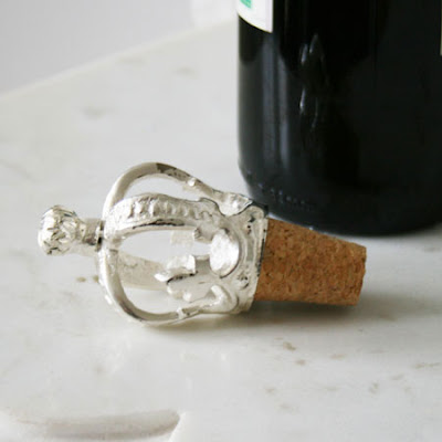
Not intentionally, this last find also follows nicely the one above. This Crown Bottle Stopper is another great gift find.
Now the only trouble I have with all this, is that I can never purchase any of these as they only ship within the UK. In some ways that's a problem, on the other hand it's a good thing. Nothing quite like some retail therapy, minus the expense.

April 1, 2010

Samantha Robinson Studio on Decor8

On the top of my decor wish-list is a ceramic piece from Samantha Robinson. I have shared some of her beautiful work here and here. Today over at Decor8, Holly is sharing an photographic tour of Samantha's studio. Pop over there and enjoy it for yourself! Also check out the photographers post - Australian Photographer Jillian Leiboff. Also check out the drool worthy Pumpkin Spice Cake she recently experimented with!
{image from Jillian Lieboff}

Colour School

This morning I received a newsletter from Australian Design Review announcing the winners of the 2010 Dulux Colour Awards. One of them caught my eye and I wanted to share it with you.
 This wonderful use of colour is part of the award winning design of Fitzroy High School in Victoria, Australia.
I'm certain many of you don't remember going to a school that looked this good! The most creative part of my school was the student murals. It sounds like a very interesting project where colour has been used in both an aesthetic and functional way and I hope the students appreciate their wonderful environment. I think your work or study environment is so important... though if you saw my space at work you would not think I felt this way. I have had good intentions to make my area at least reflect a tiny bit of personality. Currently it is a pit of spreadsheets and other boring documents that would never hint at the fact that I am in a creative role. Seeing this totally funky high school has inspired me to do something about this... but after the Easter long weekend.
It seems there is not update yet on the Dulux Awards site with details of the 2010 winners and more images, but we should be able to check back soon for more information.
Another image winner featured in the Australian Design Review article is the winner of the Residential Interiors category.
This is Prahan House by SJB Interiors and you can see why it won a colour award - that jolt of green on the floor is pretty incredible! Check out the SJB website, it's full of amazing projects they have done. I couldn't find any more images from the Prahan House, but I will keep my eyes out!
{all images from Australian Design Review}

LinkWithin

Related Posts with Thumbnails