Showing posts with label Pretty Home. Show all posts

September 27, 2010

pretty places - the happy home

The Happy Home blog is one that has been in my 'daily reads' list for a while and today I want to share a tale of curtain rods. Belinda Graham is the web editor for Real Living magazine (a favourite of mine for very practical but stylish ideas) and she also authors this lovely blog sharing some fabulous decorating ideas as she renovates her home.
I was reading through the pages of her blog and came across her "Let there be (temporary) light" blog post. It is Belinda's tale of tracking (or hunting) down curtains (and lights) for her living room. I found myself laughing out loud and nodding along as she recounts her treks to Ikea and the "choose-your-own-curtain-rod buffet" at Spotlight as I too have recently walked the same path. While perfectly OK, the living room curtains that came with our house are hung off the ugliest curtain rod and rings I have ever seen (they are also in our bedroom). All the other windows in our house came with timber blinds when we bought, taking away the dilemma of window decorations when we moved in and we have just put up with the rods for now. We have two sets of tall sliding doors that lead out to our courtyard and the curtains (completely OK dark chocolate bouclé fabric) fit the decor well and more importantly keep the cold out in winter and the heat in summer. So far I have found some pretty decent ready made curtains, but alas we have lovely high ceilings which = non-standard curtain drop lengths. In turn this means custom made curtains = $$$$ and so new curtains go back to the home decor wish list.
There is hope though - and this is where Belinda and her blog come in. There was more head nodding as Belinda recounted her desire for white curtain rods on her white walls. She has ended up with black rods (read why in her post and see the lovely picture above) and I think that she has saved me from a decor obsession. You see I was having trouble finding white curtain rods I liked with the right level of "whiteness". I agree with Belinda that darker curtains on a white rod could end up looking like they were floating mid air. So with that blog-land has given me inspiration - perhaps I can keep the curtain we have but just find a replacement rod - and it doesn't have to be white - hooray!
Please pop over to The Happy Home blog and see if she can inspire you too.

September 10, 2010

a dash of colour - colourful furniture

As mentioned earlier this week, the arrival of spring here in the southern hemisphere has got me all inspired to throw around some colour! Here are a few inspiring ways to add some colour around your home....
This charming writing desk is from the wonderful and witty Jo from blog Mo and Me. If you need a nice time out, head over to her blog and read all about how Jo and Mo 'collaborate' in crafty, creative ways. You can read about Rudi the writing desk here.
More witty fabulous and colourful inspiration from Mo + Me. This bright cabinet was christened Mrs Schmitt when Jo found a piece of paper with a quote for a day out at the zoo bus trip with coffee and cake. It was addressed to a Mrs Schmitt and so the cabinet was named. Read about Mrs Schmitt over here and see how she fits into a bright and colourful room.
Another talented blogger is Louise of Pour toujours blog. This is her 'Magical' yellow bedside table. Louise has done some wonderful "upcycling" in bright and vibrant colours. See some of her other projects on her blog here.
This great injection of colour is certainly a way to add some personality and fun to a room, or hallway in this case! Check out the story behind Kathrin's bold but fantastic pink door here at her blog Where Your Heart Is. I also love the way the hallway is painted grey on the bottom half, and the art wall arrangement. You can see more of this lovely home in Germany here on Flickr. Another of my favourites is this incredible bright red bookcase....
So are you now inspired to inject some colour into your home now too? I like the idea of painting the back of a door a colour. I think it makes for nice surprise when you open the door!

September 8, 2010

a rescue project

I think it's the change of seasons that is drawing me to colour. As flowers bloom and things generally are getting greener, I have found some great examples of people brightening their homes through bold use of colour and pattern. First up is some of the wonderful work by Clara from The Home in Paradise
 
This charming shelf unit is affectionately named Inglorious Bastid and was given one last chance by Clara. See how she transformed a cheap and dull piece of furniture into something new and fresh in this blog post. I love all the before and after shots and step by step details. We have a similar story for a set of shelves in our home. I had used the shelves for a while but when we upsized our home, they became redundant. They were actually at the front door waiting to be taken to the rubbish when a moment of inspiration struck and I imagined the daggy 'pine' laminate replaced with a gloss white finsh. After a quick trip to the hardware store for primer, paint and some new handles we had rescued our own "inglorious bastid" and it lives on as a gloss white shelf for my cookbooks and magazines. It's actually quite rewarding to tackle a little project like this. You feel a sense of pride in bringing new life to a piece of furniture!

Do you like the look of those magazine holders in the second shelf? Well the crafty Clara has created these from the flimsy cardboard magazine holders from Ikea, but also suggest using cereal boxes too. So clever! I like the idea of putting your own stamp on things, and simple (cheap) projects like these are so easy to take on. Get the 'how to' over here and please also check out Clara's blog . There are lots of great stories and projects that Clara has taken on in her home in the Caribbean. Who knew a keyboard and mouse could look so pretty!

August 30, 2010

bedtime dreaming

Have you discovered Serena and Lilly? I had not heard of this amazing store before, but somehow found myself recently getting lost in their catalogue online. It seems that they have star pulling power with with Nicole Kidman and Jennifer Garner as fans of their nursery ranges. 
I think that dressing your bed is such a little, simple pleasure that can make such a big difference. Over the weekend I swapped around the throw cushions I have on our bed, from creams and blue to greens, and it is like I have a new bedroom! I love how simple it is to make a decor change with linen and cushions. Here are some totally dreamy images from the June 2010 Serena and Lilly catalogue.
 
Aren't these dreamy images? The prints in the bed linen is wonderful, as are the combinations. I really like the bold black and white softened by the green, as well as the soft pink used under the crisp blue and white above. Now how about these kids rooms.....
A room certainly fit for a little princess, how wonderful is this colour combination... and for the boys there is this great sea inspired room.
I love the vintage sails hung behind the bed and paper pirate hat touches! I would love to know who the talented stylist is behind these images!
Warning:: try and avoid being clucky when you see some of the nursery images...
Again another incredibly styled image - how wonderful are the paper cranes! This colour pallete is divine too.
Here's another childs room with a pop of colour - a great combination of blue and persimmon/orange.
There is so much inspiration in this catalogue, I've come back a few times just to browse! I even love the way they display the paint colours available.
I also really appreciate that there are lot's of decorating tips both on their website and in the catalogue. They show you how to out some of their looks together.
Check out the Serena and Lilly website (there's a local Australian version too). You can head straight for the catalogue here too if you need more amazing inspiration.

August 18, 2010

I want to live in CB2

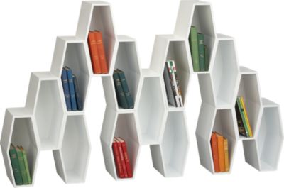
I have some serious retail envy for anyone who has access to a CB2 store in the USA. As I flick through their catalogue I find myself thinking, yep I could live in that room, that room, pretty much every room. It's a combination of really cool and different products, with great styling and photography. Here are a few pieces I would buy and the rooms I would live in...
This room above is made cool by the Hive Storage Unit. Coming in blocks of 3 hives, you can stack them and combine them to make your own sculptural display to house books and other nick-nacks. Did you also notice the floor lamp with the red power cord? Finally a power cord you don't need to try and hide in and around furniture!
There are 2 features in this room that I would really like - the Gear 'C' Table and console table and then the incredible Chop Chop wooden side table/stool. I really like the combination of the minimalist glass and metal Gear range with the big, chunky timber pieces.
These Chop Chop pieces also have a great back story. Using recycled urban forest timber only from trees which have been felled if they are suffering from damage caused by wind or old age, the production process is then done with minimal environmental impact. Each piece is oiled and waxed by hand. Read more about some of the people behind this project on the product info page.
Another cool CB2 room here features the Array Silver bookcase. Also check out the use of it as a towel holder in the bathroom (click through the little pictures under the main one here)
I do have a thing for yellow and love this combination of yellow chairs with the timber table, but what really caught my eye was the collection of Lumi Candleholders clustered together in the middle of the table.

I like the simplicity of these shapes and how fabulous they look with a long taper candle in them. Even better, they are pretty cheap - $2.95 - $4.95 USD - so you could afford to buy many to recreate the clustered look.
This last room close up features some pure CB2 quirkiness. The un homme and une femme vases (on the wall in the background, are one of those great features you could add to your home for a bit of unexpected fun. You can top them up with anything you like and change the way they look. Again they are so cheap, only $6.95 USD so it doesn't cost a fortune to have something different!

To add some more fun to your workspace (because every office desk needs something fun) here are a few more accessories that make me smile... I hope they make you smile today too!

August 10, 2010

more marimekko

Here are a few more pieces of eye candy from Marimekko.

The Oiva tableware range combines a graphic black and white pattern with bursts of colour on simple shapes. The pieces were designed by Sami Ruotsalainen and the patterns are the work of Maija Louekari. I like the shapes of the pieces. They feel somewhat organic with the simple shapes. I also like the way the print isn't perfectly centred like on the large black and white plate.
Don't they look great all stacked and mixed together? I saw these pieces quite often and really like when they are mixed back with simple plain plates.
Another favourite is the Kippis range. Kippis means cheers is Finnish and this pattern was also designed by Maija Louekari.
 I can see some reference to the classic Kastehelmi range of glassware from Iittala originally designed by Toikka in 1964. I like the idea of referencing a piece of classic Finnish design (which you see in many Finnish homes) in a new design piece.

August 9, 2010

Finn-tastic fabrics

It comes as no surprise that I have returned home from Finland with a re-ignited passion for fabrics. One of my favourite Finnish habits is the changing of home decor to match the seasons. Helped by clearly defined and very different seasons, I really like the idea of having decor that changes along with the outside world. It is also a great excuse to change things around and really play with different colours and make the most of the incredible fabrics available. On one of my last days in Finland I found the Vallila range of curtains with prints designed by Tanja Orsjoki. New curtains has always been on our 'to do' list for home, but now I have become a little bit obsessed - if only I had measured up all our windows before I went away!
Today I thought I would celebrate some great seasonal Finnish decor.
Here are a few of the prints I love from the Vallila Spring Collection. These were available as ready made curtains, as well as bolts of fabric.
 

I couldn't do this post without a splash of colour and bold prints from Marimekko. These vibrant prints are part of the summer 2010 range. For a great example of the way the Finns swap around design and decor based ont he seasons, compare the summer range (here) to the more muted tones of autumn (here). It' perfectly understandable that you would prefer deep navy, green or ochre colours to frame a window overlooking the flaming colours of Autumn.

May 18, 2010

too much cool - Isa Form

I just took myself on a quick journey, wading through google translating pages from German and Swedish all because of this image.
There is just so much coolness about this room! I love the pops of green and yellow against the black and whit, the old school clock, peace sign and yellow taper candles. By far though, the stand out pieces in this room are the 2 prints - the big black and white pear and the yellow apple in green frame. I came across this image via A Merry Mishap's flickr favourites. Unfortunately I can't find the owner of this amazing room, but I have found the artist behind those cool prints.
From what I can tell Isa from Isa Form, found this great use of her prints from a fellow Swedish blogger Inspiration and Design and posted them to her own blog.
These 2 prints, pear and apple are from Isa's kitchen print range. I think they are so unique and just too cool.
There are plenty of other great prints to choose from in a range of categories, like Nature, Love and Buildings.
This is the Yama ki print from the buildings range and is another great use of simple black and white and an eye-popping colour. Anyway, I've had a fun journey and can only dream of having a dining room that cool!

April 23, 2010

the art wall

I stumbled across a new little creative corner of the web the other day - The Art Wall
It is a curated collection of wonderful artworks by wonderfully talented people. I love the presentation of them in illustrated rooms.

The above is the current collection on display in the Dining Room. The wonderful room illustrations are by talented artist Jessica Swift - who has a wonderful portfolio to check out. Each room is based on the Art Wall's proprietor Katie. I really appreciate the effort Katie goes to pulling these collections together. You get to see a variety of artworks in various mediums from many different artists. I really like the common cool colour theme running through the above collection. All the artworks are for sale, often through the artists own etsy store and the price range is capped at $500.
 The Art Wall is certainly going to be a new place I drop by regularly for a dose of inspiration.
 Today I have fallen for this Galoshes and Skirt Print by Jen Hewett, currently hanging in the Kitchen.

April 19, 2010

let's get outside - Terrain

I'm not sure why, but I've been a bit flat lately on the whole inspiration front. Usually I have a pile of places and things I want to explore through this blog, but it just has not been coming the past few days. Luckily, all that has just changed and I have found myself being taken on a tangent and discovering something lovely to share.
I was looking through the lovely Flickr gallery of Honey and Jam, again lusting over her lovely rough mug (see it here). I read through some of the comments and found that the mug was from Terrain. I went off to google and came across this lovely homewares shop. A few things caught my eye here, like the Cast Iron Apple Pot and of course the Boulder Mug that I arrived there for in the first place, but it was something else that stirred my excitment. Eager to find out more about Terrain, I clicked a link through to Terrain at Styers. This is a garden centre (in the USA) that has stirred a green thumb in my I didn't know I was in possession of!
Helped by these amazing images, I suddenly have a desire to transform my courtyard with aged timber planter boxes overflowing with colour.
I totally could see a fabulous aged urn overflowing with herbs of some sort like these above! I even have a bare patch of dirt near my front door that I could see a lovely big planter filling. I have lavender and rosemary bushes already there, but the other plants didn't make it through the drought conditions of the past years and so I'm left with a bare patch right at the entrance to our house. Thanks to terrain, I'm now inspired to fill it!
I can't really explain my sudden eagerness for gardening, and also don't think it will last that long due to it being Autumn here and probably not the best time to start out. Hopefully come spring, I can look back at these images from Terrain and get excited at the right time of year to get outside and start planting!

April 14, 2010

an ode to chairs

I think that most people have a desire for a fabulous feature chair in their home. For many it might be a designer chair like the Mies van der Rohe's Barcelona Chair or Eero Saarinen's Womb chair as statement piece in a lounge or bedroom. Alternatively you may have your eye on a Phillippe Stark Ghost Chair for a dining room.
I have a chair project at home which is always in the back of my mind. I inherited a beautiful Fler SC58 chair which was my grandfather's. Designed by Australian Fred Lowen with a strong Scandinavian influence, mine  needs some TLC in the form of a serious restoration of the frame and reupholstering. It is currently in our lounge room, but is really only fit for displaying cushions on as its frame is too delicate for sitting in. I'm hopeful that one day I can share the next stage of this chairs life. For today I will just share some fabulous chairs I have come across lately...
These are the Mademoiselle Flower Chairs designed by Phillippe Stark for Kartell. Image via made in design
I love the vibrant fabric choices available. With the clear legs these chairs almost look like they're floating. Certainly a feature chair, I can see this as a real stand out piece in an eclectic home.
Next up are these fabulous Objeckto armchairs by Missoni. Image via made in design
In this design you don't need to choose which pattern you prefer as the fabric is reversible so you can swap from stripes to the floral when you want to refresh. Again the chair design has a floaty feel to it. It looks like you would be suspended when sitting it. I picture a Mediterranean view in front of  me with a cocktail in my hand. Are you with me?
For slightly less cash I have found a few other ways to celebrate cool chairs.
This Classic Chairs Print is from the My Sweet Prints etsy shop. You can order this print in custom colours and enjoy these classic chairs in silhouette form. Visit the shop here

Finally, for a truly great way to celebrate iconic chairs - my lovely friend Christina from Billy Mac has fabulous I Heart Louis girls t-shirts available and even better, due to demand from the older 'girls' out there, she has created a ladies version in ultra chic black and pink.
You can find Billy Mac through her website, blog, etsy and also madeit. For anyone with little ones out there you will surely find them a cool tee there!

LinkWithin

Related Posts with Thumbnails